ESEA Website Redesign
ESEA has improved leaps and bounds over the last years with a redesigned ESEA Client and shocked the cheating underground with the most advanced anti-cheating technology updates including detecting hardware cheats. At the same time, we have released industry first updates such as .Clips that allows you to share your favorite highlights with a simple in-game command and leaderboards allowing players to track their advanced statistics. Additionally, we’ve created new Rank Leaderboards and recently doubled our pug prizes for players across every level from Ranks A through D up to $160,000 a year!
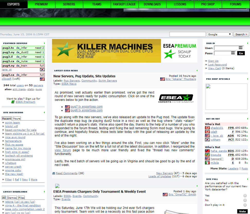
The updates mentioned above have generally been focused on your in-game experience, how you interact with CS:GO, how you are matched up with other players to ensure that you get the most out of your matches. Despite adding new pages and features to the website the full use of these improvements were limited by outdated design practices. In general, pages such as the leaderboards appeared somewhat out of place when surrounded by the old website panels.
Today we are happy to bring you the first iteration of our next big project: redesigning the ESEA website!

Website Redesign
Throughout the last few years, we have received many suggestions from the community that a facelift to the website was in order. As a result, we brought on external designers who have been hard at work with our engineering teams to not only enhance the aesthetics but also to lay a foundation that provides a more efficient process in updating the site. This means that future updates to the website will be less taxing from a development perspective and allow us to make more regular updates moving forward.
We have already started to drill down into some of our most popular pages and are working on adding more functionality to give a more in-depth experience for our veteran users. You will be able to see the fruits of this work over the next several weeks as we continue to release improvements as they become polished and ready for launch.
Starting today you can visibly see changes to some key pages, and other pages will remain in the old version until they are complete. Read below for a detailed breakdown of the following:
- Player Profiles
- Statistics Section
- Clip/Streaming Pages
- Forums and Guestbook
- Match Pages
- Mobile Site
Player Profiles
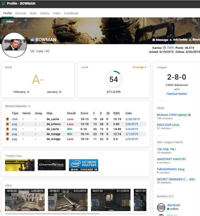
We have restructured the player profile to try to give more focus on critical elements that you would be proud of such as your Rank, the badges you have collected, how much you have played on the platform, etc. We have de-emphasized some legacy features such as RWS (which has been moved to your stats tab) and have removed less useful elements like views and flags entirely. Similarly, we’ve tried to bring more focus on key features such as more clearly differentiating an ESEA League team from Ladder/Scrim teams. Also, we’ve given more real estate to showcase your best .Clips and compressed the buddy list/recent posts etc. which previously took up significant portions of your profile.
An example new profile is below:

Statistics Section
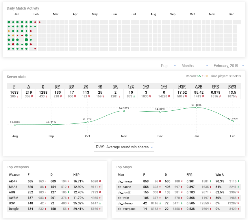
Although we have taken RWS off of the main profile, we have revamped the statistics section to make it more visually appealing. All of the vital information from before is still available however we’ve also added a chart at the top of the tab so you can easily see how active a player is. Winning days will are colored in green and losing days are marked as red with tied days being marked as orange. The bigger the circle, the more wins/loses the player had on that day.
An example is displayed below:

Similarly to the profile page, we have restructured the statistics tab based on what is most exciting and moved things like “dominated by” toward the bottom.
Video/Stream Pages
We have merged the .clip and stream tabs into a single page where you can view all of a player’s video content. If they are live, their stream will be more prominently displayed meanwhile if they’re offline you can browse through their collection of recent .Clips.
Forums and Guestbook
We have redesigned how our comment sections appear and have put more priority on individuality emboldening player names and allowing posters to have their profile image icon be displayed alongside their post. We have also made changes to make comments replied to appear more clearly embedded in a post. The combination of these changes should make following a massive thread easier.
Match Pages
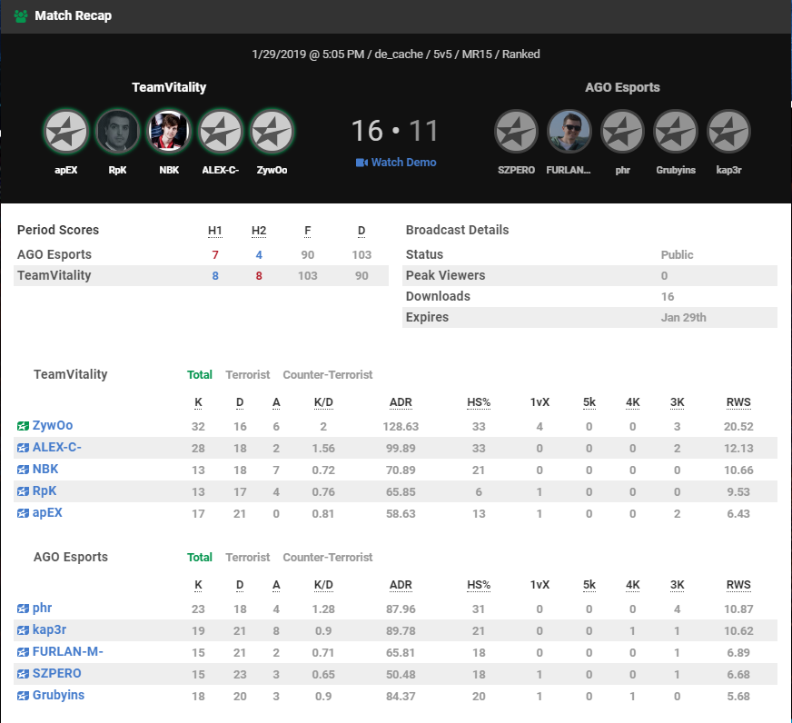
In the coming weeks, we are going to be diving deeper into match pages to provide more interesting analysis on completed matches. For the time being, we have cleaned up the match page to make it easier to get all of the critical information and lay the foundation for more features to come.
An example recent match from our EU MDL division is displayed below:

Mobile Site
Over the last few years, we have seen a significant increase in mobile users despite our old site’s relatively weak support for mobile browsing resulting in a lot of effort zooming in/out. As a result, we redesigned the site with mobile in mind which should create a much more enjoyable browsing experience from your phone/tablet. Moving forward, all updates will be streamlined and mobile compatible.
Feedback
This project is far from finished, so we would love to hear what you think about the redesign, including features you would like to see added moving forward, constructive criticism regarding current changes, or any bugs that you may encounter. We are always looking for ways to improve your experience, so please let us know via the forums or a suggestion support ticket!
We hope you enjoy the first of many things to come in 2019!
specific CS:GO artwork provided by Patrick Mazzolo
